Form follows emotion
Insights into the A. Lange & Söhne design process
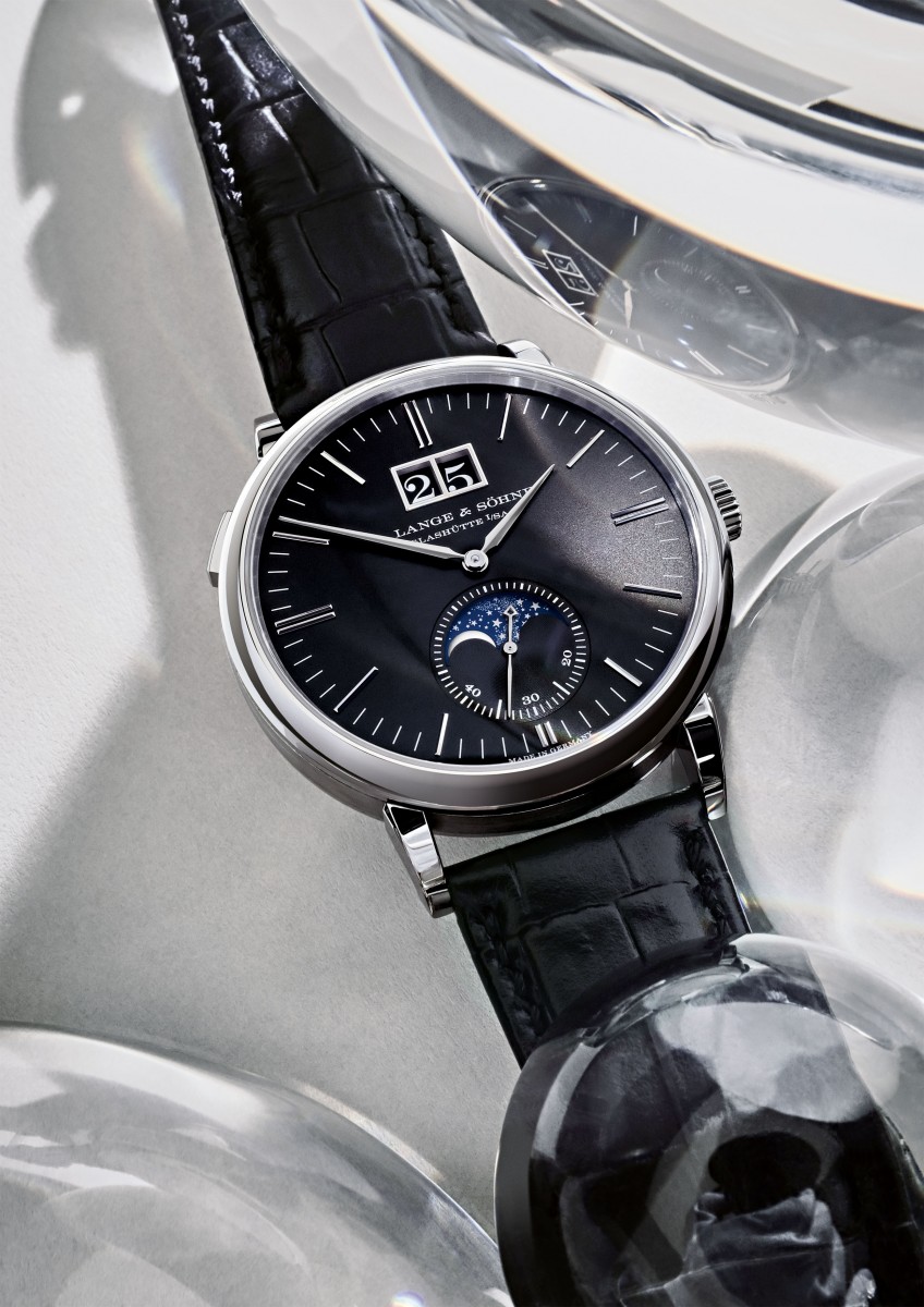
At the Geneva Salon early this year, A. Lange & Söhne presented five debuts in elegant black: two models each of the Saxonia Moon Phase, the Saxonia Outsize Date and one of the 1815 Chronograph. Now, they are available on the market. Berlin-based photographer Attila Hartwig took the opportunity to focus on the design of the watches with a series of architecturally inspired stills.
The watch as an architectural structure
The clearly structured dial of a Lange watch conceals a highly complex mechanism that can easily be compared with the Cloud City location in Star Wars. A. Lange & Söhne’s Director of Product Development Anthony de Haas sketched out a science fiction scenario: “If we could beam ourselves into a multi level watch movement, we would be exploring a mechanical universe in which everything is designed with architectural precision and located in exactly the right place.” Starting from a certain scale, the apparent chaos becomes organised, structures are discernible, and order sets in.
“The sleek dial of an A. Lange & Söhne watch resembles the elegant facade of a modern building,” Attila Hartwig muses. The Berlin-based photographer recently portrayed this year’s debuts: the Saxonia Moon Phase, the Saxonia Outsize Date and the 1815 Chronograph. Inspired by their lucid design vocabulary, he built backgrounds composed of layered Perspex panels, prisms, and mirrors. The transparent materials and reflective surfaces produce a diaphanous atmosphere of architectural rigour.
Lange’s design and engineering principles
As the result of an ongoing development process that combines progressive technologies with artisanal finesse and timeless aesthetics, the new watches reflect the meticulous approach of their designers: “We implemented only minor adjustments in the proportions,” explains Anthony de Haas, “but of course, such details have a great impact on the overall aesthetic appeal of a watch.” Thus, only an expert would notice that the date display of the Saxonia Outsize Date is slightly smaller than that of the Saxonia Moon Phase. Given that the case diameter was reduced from 40 to 38.5 millimetres, de Haas decided to proportionally reduce the size of the outsize date – by exactly four per cent – in order to preserve the visual equilibrium.
The dial of the 1815 Chronograph was painstakingly analysed as well and improved to enhance the harmonious overall impression: Due to the integration of a peripheral pulsimeter scale, the radius of the minute scale had to be reduced. Accordingly, the hands were slightly shortened and narrowed. The designers replaced the brand arc above the axis of the hands with the A. Lange & Söhne signature at the outer edge of the dial.
Black – the connecting element
The most prominent hallmark shared by all five debut models is the deep black face of their solid-silver dials. The dark backgrounds form a striking contrast with the solid-gold hour markers and white inscriptions. “Sharp polarities produce the most vivid compositions,” Hartwig says. His arrangements emphasise the clarity of the dials but stand in deliberate contrast to the mechanical complexity of the movements.
At first sight, A. Lange & Söhne watches look functional and efficient, but the design process does not quite adhere to the “form follows function” doctrine. While most designers attempt to rationalise their approaches and concepts such that they can be justified beyond aesthetic categories, Anthony de Haas’ team chose a different route: “Of course, the same functionality and precision could also be achieved with less effort. But for us, the priority is always on the emotional experience.”


